Pages

Tuesday, 7 May 2013

Project 6

MANIPULATING FABRIC

I created a Manipulating Fabric Board on Pinterest, to collect some ideas.

STAGE 1 - PREPARATION
My fabric samples are already sorted into colours and stored together.  So I went onto Stage 2 and then just picked out any pieces of fabric that I thought would be suitable.


STAGE 2  - DEVELOPING DESIGN IDEAS
I chose six of my drawings/photographs to use for this stage of developing design ideas. 


1. Old Horseshoes 

I had already created a mood board for this photograph in Project 3; Stage 4 - Exercise 2.  I love the texture and colours in this photograph of some old horseshoes that I find when I am digging in the garden.


2. Barnacles

My second choice is from Project 3; Stage 6 - Exercise 2.  I had taken this photograph of barnacles on a breaker on the beach at Barmouth.


I had developed this into some mixed media ideas and a French knot piece.  And I felt that these ideas could definitely be developed further.

The next three choices are all from Project 3; Stage 4 - Exercise 1.  I choose them because I liked the colours, the texture and thought that they could all be usueful starting points for further exploration.

3. Fire/Hot

4. Cold

5. Calm


6. My final choice was Stained Glass

This is a photograph I took of a series of seven panels of stained glass in The Brewery Arts Centre and Restaurant in Keswick.  These hugh panels of fused glass represent seven themes associated with the centre - Visual Arts, Theatre, Dance, Film, Music and Food.  They were designed and installed by Northern Lights Stained Glass (also from Keswick).


I used this as inspiration for Project 4; Stage 2 - to develop design ideas.  I like the graphic quality and the colours.


STAGE 3 - APPLIED FABRIC TECHNIQUES
I made two machine sewn samples using the fabrics I had chosen for the old horseshoe image and some knobbly wool.  I am really pleased with the lower sample.  I think this has picked up the colours and the textures of the original image.  I also like the small sample with the hand stitching.  I think both of these ideas could be developed further.


I continued making a number of small studies using various fabrics, buttons and beads.
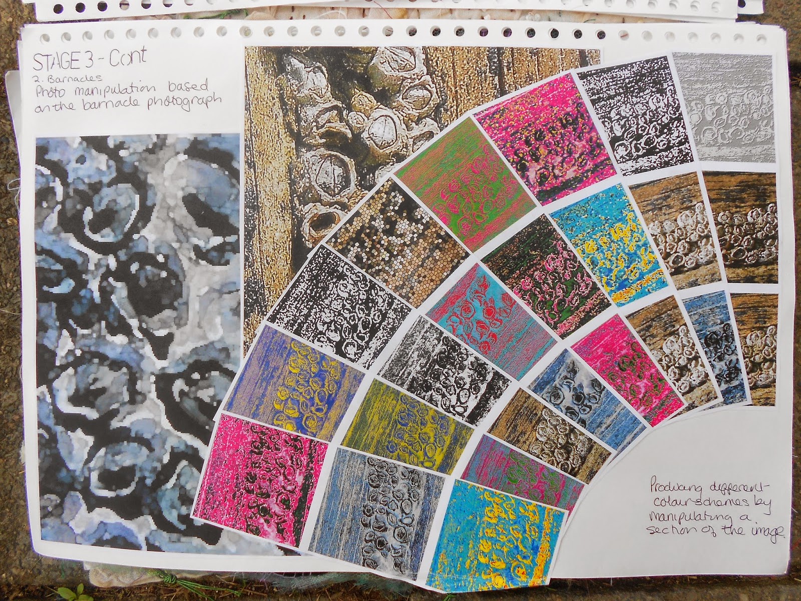
I took the image of the barnacles and isolated an interesting part.  I then manipulated this on the computer.  Enlarged it until it was unrecognisable and changed the colours.  I then took the sample and just kept playing around with effects and created a whole array of colours and ideas.


I also created small appliqué pieces.


For the fire image I tried gathering and manipulating the fabric, but I didn't like how this was looking.  I tried small strips of different fabrics held down with a simple running stitch.  I was very pleased with how this turned out, so repeated the idea for the cool image.  I think these samples are really successful.

For the calm sample - I manipulated the image with high contrast and then selected small parts to enlarge and re-colour.  I then experimented with circles of fabric and nets and sheers.  


Based on the paper collage of the stained glass - I created a piece using sheers, sheens and nets.  I like the way the colours are changed by the overlay of the sheer layers and the glittery fabric shows through - giving the impression of the original glass.


To develop this further, I recoloured the image and enlarged it and then tried it in a different colour-way.  The fabric sample is lots of squares of fabric, machine sewn in squares and then cut back to reveal the fabric below. I think the sample has worked well to represent the surface texture of the glass.


For my final sample for this stage - I chose the calm image.  For the background I used a piece of dark purple velvet.  On to this I layered strips of various sheens and sheers in greens, purples and lilac.  Over the top of all the strips there is a piece of lilac net to hold everything in place and then a final piece of turquoise-green organza.  I then cut different size circles out of various purple and green fabrics and used blanket stitch to hold them down.  I used blue-green-grey thread for the running stitch on the background.  I love the colours in this piece and am happy with how it has turned out.  I think it is a good development from the original image.


STAGE 4 - RAISED & STRUCTURED SURFACE TEXTURES
GATHERING


  1. Rectangle of fabric, single line of gathering in the centre
  2. Rectangle of fabric, single line of gathering at each long side
  3. Thin strip of fabric, double line of gathering in the centre
  4. Small strip of fabric, folded into pleats, held down with running stitch
  5. Circles of fabric stitched in the middle, pulled tight, bead added
  6. Suffolk Puff - circle of fabric, gathered around the edge, pulled tight
  7. Strip of fabric, folded, single line of gathering at edge.
  8. Furrowing
  9. Spot fabric, stitched around spots and pulled tight
10. Grid marked on fabric, stitched on marks and pulled tight


FOLDING & PLEATING
11. Smocking on a piece of gingham
The fabric wasn't really suitable for this and a piece of ordinary gingham would have been better.

12. Smocking on gingham
I used a piece of small check gingham to try out various sizes of smocking using the squares as a guide.  This shows the various surfaces that can be created using different sized grids.

13. Smocking on a piece of plain cotton
This fabric was more suitable for this technique and for a first attempt I think it has worked well and gives a really good surface texture.

14.  Smocking on a piece of check cotton
Again I used the squares in the fabric to create the smocked effect.  I really like how this has turned out and the way it has broken up the squared surface of the fabric.


TUCKING
15. Pin tucks stitched down at both sides and stitch the opposite way in the middle
16. Circle of fabric with a hole cut off-centre and pin-tucked around the edge
17. Gingham fabric with random pin-tucks 


TEARING, FRAYING & SLASHING
18. Layers of organza, machine stitched together and burnt into
19. Layers of fabric, stitched in lines at various intervals, slashed and machine washed to create the frayed edge.  I had to cut a lot of the fraying off as it was taking over the sample.


QUILTING
20. A sandwich of cotton :: wadding :: velvet - stitched into with random French knots
21. A circle of muslin, with a gathered circle in the middle, stuffed with wadding

RAISED SHAPES
22. A piece of calico with 3D things stitched to it - various sized curtain rings, a shell, a bead, a button - with a piece of calico manipulated and stitched down over the top.  Seed stitch and French knots added.  A piece of moulded organza also caught down to add interest and texture.


MOULDING
I tried various fabrics - using a small elastic band to secure them - I tried different items to create shapes - marbles, glass nuggets and screws.  I then steamed the fabric until it held its shape.  Once the fabric was cool I left it to dry and then removed the elastic bands and shapes.

A SAMPLE
For my final sample I decided to develop the barnacle image.

I used a piece of muslin and a piece of striped organza.  I fixed glass nuggets into these fabrics with small elastic bands  I then soaked the fabric in a strong solution of coffee before steaming the fabric in the microwave until the fabric held its shape over the nuggets.  When the fabric was cool, I left it dry and then removed the elastic bands and the nuggets.

The background fabric is a piece of poly-cotton.  I cut the muslin fabric to the size required and then used the left-over pieces to fill in the areas that needed more raised shapes.  I also attached the piece of organza to create a subtly coloured area.

I used dark brown thread in a running stitch to attach all the layers together and catch down the extra pieces.

French knots were then added where needed.

I am really pleased with how this piece has turned out.  I like the addition of the organza, which has added an area of colour and texture.  I also like how the coffee has stained the top of the nugget shapes more than the sides.


REVIEW OF ASSIGNMENT 3
How does working with fabric in this way compare with working directly with stitch?  
I have really enjoyed this assignment.  I like working directly with the fabric.  I have enjoyed working with muslin, which is lovely and soft and easy to manipulate.  I like being able to crease the fabric and ruffle it to create a textured surface on which to stitch.

Are you pleased with the shapes and movements that you have created in both appliqué and fabric manipulation?  What would you do differently?
I am pleased with the work I have done.  Both of the final samples have worked well and I have used a lot of techniques that I haven't tried before; smoking; quilting; raised shapes; furrowing.  I wonder if I need to be a bit neater in my experiments.  I have looked at other people's pin tuck samples and they are beautifully made.

How did the pieces work in relation to your drawings?  Were the final results very different from the drawing?  Did the fabric manipulation technique take over and dictate the final result?
I think the first experimental pieces were quite different from the drawings but had elements that were definitely related.  Both of the final pieces were more like the drawings - although the fabric manipulation created a further dimension.


Was it helpful to work from the drawings in the appliqué exercise? Would you have preferred to play directly with cut shapes and materials?

I don't mind either way.  I find it fairly easy to just pick up pieces of fabric and thread and play around with little ideas.  Relating them to the drawings was harder but there was less choice to get distracted by.

How do you feel about working with stitch in general?  Is it an area you would like to pursue in more depth?  Do you find it limiting in any way?
I love working with stitch.  I find hand-stitching very relaxing and the fact that you can pick it up at any time and that it is portable is very useful.  I like the freedom of stitching and the ability to build up layers and textures.  I don't really find it limiting at all - I think the possibilities are boundless.


Sunday, 5 May 2013

Assignment 2 - Tutor Report

Overall Comments
This assignment demonstrates that you are developing a clear understanding of colour theory and are able to apply this to subsequent project and sketchbook work.  There is also evidence of an increased understanding of the design process and this is shown in the extent to which you have successfully drawn upon your own starting points and imagery in order to develop your creative ideas further. You are aware of the importance of presenting your work in a coherent and logical way and your thinking about the development your work is clearly articulated in your learning log/blog. Your ability to reflect on this is also becoming more apparent. Try to develop your critical thinking further by making more explicit reference to exhibitions you have visited or artists’ work which has inspired you in your own practice.

Assessment potential (after Assignments 2 and 4) 
I understand your aim is to go for the BA Textiles Degree and that you plan to submit your work for assessment at the end of this course. From the work you have shown in this assignment, providing you commit yourself to the course, I believe you have the potential to succeed at assessment.  In order to meet all the assessment criteria, there are certain areas you will need to focus on, which I will outline in my feedback.    
  
Feedback on assignment
Project 3 Colour
Aim:
  • To help you to understand and actively explore basic colour theory
  • To develop an understanding of the relationship between colour and mood
  • To apply your knowledge of colour theory to the development of sketchbook  work
I was pleased to see you experiment with a variety of media in this first project. This allowed you to see the differences between these and to assess their value for the intended purpose. You expressed some dissatisfaction at the lack of density of colour in the colour wheels. I think that maybe using gouache would yield a more satisfactory outcome for you.

Further experimentation with colour relationships and colour matching strengthened your colour mixing abilities. I agree with your comment regarding the purples. With the printed image sample, you could try adding a little more white to the mix. It’s also always worth remembering that it’s very difficult to match colours exactly across media i.e. from printing inks and fabric dye to paint. Your still life analysis made very good use of complementary colours e.g. in the purple shadows under the citrus fruit. This has the effect of heightening the colour intensity of each complementary; a point worth remembering when selecting fabric and thread.

Your increasing confidence in combining mark making and colour was very much in evidence when creating mood and feeling within your drawings. I particularly liked the contrast between fire and ice. Howe do you think you could apply this knowledge to working with fabric and stitch?

In your coloured stitch samples, I think you realize the value of using basic stitches to vary the density of colour and to explore the properties of optical colour blending. I found the seed and detached chain stitch particularly interesting. The character and appearance was totally transformed when you reversed the colours. Which did you prefer and why? It’s also always worth remembering with this exercise that the black background leaches the colour from the primaries and the red in particular appears less vibrant.

Your French knot samples were two great examples of how you can make the gradual transition from one solid block of colour to another. Although you felt that the technique of mixing the thread colour in the needle wasn't successful, I thought that this lent an increasing subtlety to the gradual colour changes. It would be interesting to work another sample where you didn't do this, to compare.

The final sample, where you translated your ideas into stitch was a strong piece, supported by a very good choice of visual imagery. I liked the way that this became very much a mixed media piece. This strengthened the lovely textural effects you achieved with the barnacle/knot stitching. Is this a sample that might go further do you think?

Understanding the textile world
Christening Gown
This was a lovely personal choice and good for you to return to something you had created many years ago. This gave you valuable insights into the technical constructional and materials detail. However, to what extent do you feel that its design for example, reflects the era in which it was made? You could maybe have broadened your research somewhat by considering the wider social, cultural and historical implications of garments that reflect rites of passage. There is also the interesting question of heirlooms and what they mean to families and individuals. For example, what is its significance to your daughter?

Project 4 Developing design ideas
Aim:
  • To help you to develop your compositional skills
  • To help you to understand the interrelationship of the elements of design
  • To use a design process in order to develop your visual ideas

I felt that from your reflective comments in your learning log, you did not fully understand why you were asked to carry out the first exercises. What you are looking at here are basic principles of composition so that when you talk about a more dynamic line, it is this which is creating visual interest and vibrancy within a defined space. You might like to return to these exercises and use them to analyse a painting or one of your own compositions which you produced for the next stage. Here you worked well with combining the visual elements to produce some great starting points from which to develop your ideas further. You might like to give some further thought as to which media best suited your purpose. For example, the two collages gave you a very strong graphic image to work with whilst the pastels were much softer and more diffuse. Which medium was most suitable for achieving the effect you were looking for? How might this influence future choices of textile materials and techniques through which to interpret your designs?

I liked the idea of the pottery shards very much indeed and I thought that the bleach and tissue was a really good way of interpreting your designs. Could you take this further by adopting a more random approach to combining the different patterns such as tearing and layering the different pattern samples, with the same randomness as the pottery pieces?
  
Interlude experimenting with printing and painting
Experimentation here included some valuable work with repeat patterns, based on earlier design work. You showed good understanding of what makes for an effective repeat as in the burnt paper sample. This reminded me of Islamic tiles. Further research maybe? In the same way, with the seed head, which was a very stylized interpretation, you might like to refer to some of Charles Rennie Macintosh’s designs or the contemporary designer, Angie Lewin.

Project 5 Painting and printing.
Aim:
  • To help you to develop design ideas through the use of paint and print.
There was evidence of a good range of experimentation here with different combinations of inks, dyes, fabric paints and crayons. As you discovered, by varying the fabric surface and absorbency, you can create some very different effects even when using the same printing process e.g. the ‘stamped design sample sat on the surface of the linen, highlighting the textural quality of the print whilst the brush stroke sample quickly absorbed through fabric.

I felt that this project’s strength came from the consistent way in which you tried out and then refined your design ideas. This came through very strongly in your final print of the seed head where you brought together earlier designs very well indeed. In your reflection, try to analyse why you think this was so. Is it maybe the combination of the more solid textured geometric background shape with the simple line drawing? To what extent did your choice of a half drop repeat enhance the final design by giving it a strong diagonal line? How would a different colourway alter the feel and appearance of this design?

Learning Logs/Critical essays
Your learning blog continues to give some good insights into the development of your ideas and your own progress. Try to extend this to analyse outcomes further in terms of identifying possible ways forward. I feel that you are still uncertain about the extent to which you can use your drawings as a starting point for your design ideas but you are in fact doing this! Maybe you are imagining this to be a more complex process than it is.

Sketchbooks
I like the way that your sketchbook is feeding directly into your project work. Where this is the case, can you maybe cross reference by pages numbers? There is also a good balance between observational drawing, experimentation and design possibilities. In the case, of photos, beware of including them indiscriminately in your sketchbook. It can tend to start to look like a scrapbook if you are not careful. Ask yourself why you have included an image. What aspect of it do you want to work from to develop further? You may choose to annotate the photos explain this; otherwise, it can look at though you are just filling up pages which I am sure you are not.

Suggested reading/viewing
See in report

Pointers for the next assignment
The next assignment is concerned with primarily concerned with exploring techniques and processes many of which I suspect will be familiar to you. You might like to think about using some non-traditional textile materials for your samples. Try to push yourself beyond what you already feel confident with and experiment freely. I think you will enjoy this assignment!
  

Tuesday, 5 February 2013

Research Point - Oriel Ynys Mon

I went for a quick visit to Oriel Ynys Mon in Llangefni on Anglesey.  The piece I was most drawn to was "Angles on the Washing Line" by David Jones.


The artist was asked to create a piece to fill this particular space.  He was inspired by memories of his grandmother telling him about heaven and the angels being up in the sky and when he looked up all he could see was his grandmothers washing hanging on the line. All the angels are created in mdf and scrap timber and painted with acrylics.  

I really like these installation pieces that are created by repeating a lot of similar images.  I find this quite a joyous piece, very simple and brightly coloured and I can image the small boy looking up and imagining angels created from his granny's washing.

Link to the artists website http://www.davidjonesartist.com/

Collinette Wool Shop

I spent a fantastic morning in the most fabulous woolshop which I have just discovered about half an hour from where I live.  It sells the loveliest range of colours and yarns I have ever seen and creates very original patterns for the home and fashion.


I hadn't really known what to expect, but enjoyed a thoroughly enjoyable morning browsing all the colours, yarns and ideas.  They also run felting courses - which I shall be investigating later.  Had to make a few purchases of the most scrummy yarns!


Art Class Wednesday #2

My art classes started off with making paper shapes - folds, curls, circles, joined with tape, glue, staples.

These shapes were then used to make sketches.  I used ink and coloured pencils and pencil.

I then tried photographing the paper shapes using a spotlight to created shadows and shapes.


I then made sketches from these photographs using ink on wet paper.

I didn't have room to store all the paper shapes so I decided to set fire to them and photograph the process.

I then used the burnt curls to photograph again.

A Level Art Show

I attended the A Level art show at the local high school.  It is always a high standard of work and I always enjoy the work of the students.


This pencil drawing has got great depth.


Lovely. really large painting of fruit in the palm of a hand.  The red berries especially are really well done.


This image was so powerful that parts of it had to be covered when younger year groups were attending the exhibition.


I love looking through the sketchbooks, the variety of work and ideas are always very inspirational.


These are two of my favourite pieces.  Both painted by the same person.  I love the spontaneity and flow of the first painting.  Very simple but has a real energy.  The second painting was created from a number of separate images but I love the red hair with the blue striped top.