Pages

Showing posts with label Assignment 2. Show all posts

Sunday, 5 May 2013

Assignment 2 - Tutor Report

Overall Comments
This assignment demonstrates that you are developing a clear understanding of colour theory and are able to apply this to subsequent project and sketchbook work.  There is also evidence of an increased understanding of the design process and this is shown in the extent to which you have successfully drawn upon your own starting points and imagery in order to develop your creative ideas further. You are aware of the importance of presenting your work in a coherent and logical way and your thinking about the development your work is clearly articulated in your learning log/blog. Your ability to reflect on this is also becoming more apparent. Try to develop your critical thinking further by making more explicit reference to exhibitions you have visited or artists’ work which has inspired you in your own practice.

Assessment potential (after Assignments 2 and 4) 
I understand your aim is to go for the BA Textiles Degree and that you plan to submit your work for assessment at the end of this course. From the work you have shown in this assignment, providing you commit yourself to the course, I believe you have the potential to succeed at assessment.  In order to meet all the assessment criteria, there are certain areas you will need to focus on, which I will outline in my feedback.    
  
Feedback on assignment
Project 3 Colour
Aim:
  • To help you to understand and actively explore basic colour theory
  • To develop an understanding of the relationship between colour and mood
  • To apply your knowledge of colour theory to the development of sketchbook  work
I was pleased to see you experiment with a variety of media in this first project. This allowed you to see the differences between these and to assess their value for the intended purpose. You expressed some dissatisfaction at the lack of density of colour in the colour wheels. I think that maybe using gouache would yield a more satisfactory outcome for you.

Further experimentation with colour relationships and colour matching strengthened your colour mixing abilities. I agree with your comment regarding the purples. With the printed image sample, you could try adding a little more white to the mix. It’s also always worth remembering that it’s very difficult to match colours exactly across media i.e. from printing inks and fabric dye to paint. Your still life analysis made very good use of complementary colours e.g. in the purple shadows under the citrus fruit. This has the effect of heightening the colour intensity of each complementary; a point worth remembering when selecting fabric and thread.

Your increasing confidence in combining mark making and colour was very much in evidence when creating mood and feeling within your drawings. I particularly liked the contrast between fire and ice. Howe do you think you could apply this knowledge to working with fabric and stitch?

In your coloured stitch samples, I think you realize the value of using basic stitches to vary the density of colour and to explore the properties of optical colour blending. I found the seed and detached chain stitch particularly interesting. The character and appearance was totally transformed when you reversed the colours. Which did you prefer and why? It’s also always worth remembering with this exercise that the black background leaches the colour from the primaries and the red in particular appears less vibrant.

Your French knot samples were two great examples of how you can make the gradual transition from one solid block of colour to another. Although you felt that the technique of mixing the thread colour in the needle wasn't successful, I thought that this lent an increasing subtlety to the gradual colour changes. It would be interesting to work another sample where you didn't do this, to compare.

The final sample, where you translated your ideas into stitch was a strong piece, supported by a very good choice of visual imagery. I liked the way that this became very much a mixed media piece. This strengthened the lovely textural effects you achieved with the barnacle/knot stitching. Is this a sample that might go further do you think?

Understanding the textile world
Christening Gown
This was a lovely personal choice and good for you to return to something you had created many years ago. This gave you valuable insights into the technical constructional and materials detail. However, to what extent do you feel that its design for example, reflects the era in which it was made? You could maybe have broadened your research somewhat by considering the wider social, cultural and historical implications of garments that reflect rites of passage. There is also the interesting question of heirlooms and what they mean to families and individuals. For example, what is its significance to your daughter?

Project 4 Developing design ideas
Aim:
  • To help you to develop your compositional skills
  • To help you to understand the interrelationship of the elements of design
  • To use a design process in order to develop your visual ideas

I felt that from your reflective comments in your learning log, you did not fully understand why you were asked to carry out the first exercises. What you are looking at here are basic principles of composition so that when you talk about a more dynamic line, it is this which is creating visual interest and vibrancy within a defined space. You might like to return to these exercises and use them to analyse a painting or one of your own compositions which you produced for the next stage. Here you worked well with combining the visual elements to produce some great starting points from which to develop your ideas further. You might like to give some further thought as to which media best suited your purpose. For example, the two collages gave you a very strong graphic image to work with whilst the pastels were much softer and more diffuse. Which medium was most suitable for achieving the effect you were looking for? How might this influence future choices of textile materials and techniques through which to interpret your designs?

I liked the idea of the pottery shards very much indeed and I thought that the bleach and tissue was a really good way of interpreting your designs. Could you take this further by adopting a more random approach to combining the different patterns such as tearing and layering the different pattern samples, with the same randomness as the pottery pieces?
  
Interlude experimenting with printing and painting
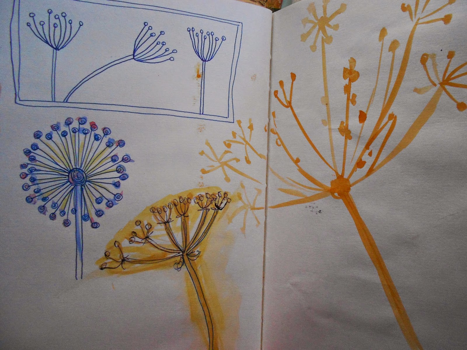
Experimentation here included some valuable work with repeat patterns, based on earlier design work. You showed good understanding of what makes for an effective repeat as in the burnt paper sample. This reminded me of Islamic tiles. Further research maybe? In the same way, with the seed head, which was a very stylized interpretation, you might like to refer to some of Charles Rennie Macintosh’s designs or the contemporary designer, Angie Lewin.

Project 5 Painting and printing.
Aim:
  • To help you to develop design ideas through the use of paint and print.
There was evidence of a good range of experimentation here with different combinations of inks, dyes, fabric paints and crayons. As you discovered, by varying the fabric surface and absorbency, you can create some very different effects even when using the same printing process e.g. the ‘stamped design sample sat on the surface of the linen, highlighting the textural quality of the print whilst the brush stroke sample quickly absorbed through fabric.

I felt that this project’s strength came from the consistent way in which you tried out and then refined your design ideas. This came through very strongly in your final print of the seed head where you brought together earlier designs very well indeed. In your reflection, try to analyse why you think this was so. Is it maybe the combination of the more solid textured geometric background shape with the simple line drawing? To what extent did your choice of a half drop repeat enhance the final design by giving it a strong diagonal line? How would a different colourway alter the feel and appearance of this design?

Learning Logs/Critical essays
Your learning blog continues to give some good insights into the development of your ideas and your own progress. Try to extend this to analyse outcomes further in terms of identifying possible ways forward. I feel that you are still uncertain about the extent to which you can use your drawings as a starting point for your design ideas but you are in fact doing this! Maybe you are imagining this to be a more complex process than it is.

Sketchbooks
I like the way that your sketchbook is feeding directly into your project work. Where this is the case, can you maybe cross reference by pages numbers? There is also a good balance between observational drawing, experimentation and design possibilities. In the case, of photos, beware of including them indiscriminately in your sketchbook. It can tend to start to look like a scrapbook if you are not careful. Ask yourself why you have included an image. What aspect of it do you want to work from to develop further? You may choose to annotate the photos explain this; otherwise, it can look at though you are just filling up pages which I am sure you are not.

Suggested reading/viewing
See in report

Pointers for the next assignment
The next assignment is concerned with primarily concerned with exploring techniques and processes many of which I suspect will be familiar to you. You might like to think about using some non-traditional textile materials for your samples. Try to push yourself beyond what you already feel confident with and experiment freely. I think you will enjoy this assignment!
  

Friday, 25 January 2013

Assignment 2 - Reflective Commentary

I found the colour exercises quite surprising.  Mixing the colours to match specific samples wasn't as difficult as I had expected, except for purple.  Looking at real objects and trying to see the real colours I found quite difficult.  I think I made a good attempt at doing this though and mixing the blue background colour with the colour of the fruit to create the shadow colours worked well.

Finding words to illustrate was difficult.  I did make a lot of samples but didn't consider them to be very successful and struggled to come up with any samples to use.

The mood boards/colours bags based on images that I found interesting was really enjoyable.  I love looking through all my samples and picking out fabric/yarn/papers to re-create the mood of the image.

The stitching exercises were interesting.  The effect on the colours depending on the stitch/spacing/proximity of other colour was surprising.  The French knot exercise was monotonous but the results were good.  I prefer the pointillism effect of mixing the colours by density and not by mixing the thread in the needle.  I thought working from an image worked well - I liked both of my sample drawings and the finished piece.

Finding design ideas was also difficult - I couldn't find anything that I had worked on that I wanted to develop. The stained glass image was successful and generated quite a number of good examples and very different feelings.  I liked the idea of using the shards of pottery that I find in the garden and isolating the designs on them.  I would like to develop this idea further.

I found it difficult to select anything from my drawings to develop into print, but once I started manipulating them on the computer I realised that anything can be isolated, repeated, flipped, etc and it always seems to produce a really interesting design.  I found them all a bit too complicated to then recreate by printing by hand though.

I enjoyed the silk painting, although this technique definitely needs more work and experimenting.

Again for the painting and printing on fabric, I found it difficult to find any of my designs that I could develop.  For my final large sample I chose various elements of ideas I had worked on and put them together into a half-drop repeat.  I like the way this has turned out.  I don’t think it is anything special, but it is a good workmanlike design.

I am glad that this assignment is finished and I am hoping that the next one doesn't make me feel like this one has.  I don’t know if it is because I have had a series of illnesses over the past four months and am feeling a bit run-down or whether the course is designed to test your mettle – but I have certainly struggled with this assignment.

Project 5

PAINTING AND PRINTING

STAGE 1 - REVIEW FABRIC COLLECTION
I selected a range of fabrics from my collection - cotton/linen/polyester/muslin/cotton jersey/calico/lining fabric/brocade.  I experimented with various techniques and medium; ink through sequin waste, fabric paint on stamp, ink applied in swirls with paint brush, ink on damp fabric, over-stamped with fabric paint on a lid, folded fabric and ink, fabric crayon rubbing, ink on wet fabric, line design wallpaper used as a stamp.


STAGE 2 - SELECTING DESIGN IDEAS
I selected some of my experiments to take further onto fabric.


I made little studies on the fabric using fabric paint and the various techniques I had already tried - raised pattern wallpaper, sequin waste, stamps, overprinting with the eraser on top of sequin waste print and using a stencil.  I also used large bubble wrap to print with ink. 


STAGE 3 - PRINTING AND PAINTING ON FABRIC
I used the eraser to print on the fabric with fabric paint, when it was dry I overprinted with the other side of the eraser that I had sliced a pattern into.

I made a Hexagon stamp and used it to print on top of bubble wrap printed fabric using fabric paint and onto a plain piece of cotton fabric                                                   

STAGE 4 - A LARGER SAMPLE
For my larger sample I decided to do a simple repeat pattern combining some of my favourite techniques from my experiments.  I liked the calm example from Project 3: Stage 4 - Exercise 1 so I recreated this - making a shape by masking of a piece of sequin waste and using two colours of ink.  I overprinted this with fabric paint on a piece of patterned wallpaper to create the lines.  I then made a stencil of a simple seed head (from my sketchbook and mood board) and used fabric paint to stencil this over the top.


REVIEW OF PROJECT 5
Do you feel you made a good selection from your drawings to use as source material for your design ideas?  
I found it quite difficult to select from my drawings, my style of drawing doesn't seem to lend itself to this kind of interpretation.  I will either have to change my style or find a different way of translating what I have drawn.  I think the images  I chose to work from have worked well as design ideas.

Which interpretations worked best?  
I think the block printing worked the best.  This is the style I felt most comfortable with.  The potato print was very successful, but the block doesn't last long.  I like building up layers of different patterns.

Why?
I like working with stamps, but once I had managed to cut a stencil, this worked successfully as well.

Which fabric did you choose?  What particular qualities appealed to you?
I chose fabrics that were smooth.  I liked working with the linen most.  It was lovely to handle and was smooth enough to work on.  It has a nice weight and drape.  I didn't like the polyester.

Is the scale of marks and shapes on your samples appropriate to the fabric?  
I think the marks and shapes work well on the fabric.  I think it has quite a retro feel.

Would any of your ideas work better on a different type of fabric, for example, sheer, textured, heavyweight?
I don't think the design would work on textured or sheer fabric.

Why?  
I think it is quite a workmanlike design and needs a workmanlike fabric.

Do the marks and shapes seem well placed, too crowded or too far apart?
I like the spacing.  I don't think they can be any closer together and if they were any further apart I think there would be too much blank space around each design.

Were you aware of the negative shapes that were formed in between the positive shapes? 
I wasn't really aware of the negative shapes that were formed. 

What elements are contrasting and what elements are harmonising in each sample? 
The background shape is harmonising and the seed-head is then contrasting with it. 

Is there a balance between the two that produces an interesting tension?
I think there is a balance and it does create an interesting piece.

How successful do you think your larger sample is? 

I think it is a successful exercise.  It isn't going to set the world on fire but as I haven't done anything like this before I think it is a very good start.  I have enjoyed taking different ideas and putting them into one design, that I consider works well. 

Do you like the design?
Yes I do like the design.  I like the colours and the fabric.  It is simple and effective.  

Have you recreated or extended your ideas from the smaller samples so that there is a visible development between the two? 
I think I have managed to develop this design from a series of different ideas. 

Does your repeating image flow across the surface without obvious internal edges, or do the shapes and marks in your single unit sample relate well to the size and shape of the fabric?  
The image certainly doesn't flow across the surface without edges but I think the shapes relate well to the size and shape of the fabric.

Do they make an interesting composition on this larger scale?
I think they do yes.

Experiments With Printing And Painting

STAGE 2 - EXPERIMENTING WITH TECHNIQUES
Working again from the mosaic image and drawings.

Block Printing
I created a series of block prints by using an oblong eraser, I cut lines into one side and used both sides - one to create a solid colour and the other to create a pattern.  I then created two potato prints - one an oblong and one a swirl.  I tried overprinting the swirl design.  I then tried painting block shapes and overprinting with a swirl pattern (which I made using a piece of stiff card and some sticky foam).


Masks and Stencils
I made a hexagon shape stamp and printed various shades of blue and green blocks.  I then overprinted - using sequin waste as a stencil.  Then created a pattern with paint on the end of a cotton bud.


Hand Painting on Fabric
I have never painted on silk before so this was a real experiment.  I didn't have any white silk so I used a piece of blue silk from my stash.  I wet the silk then used a sponge to apply a yellow colour.  I then made shapes with purple ink using a brush.  I don't think this was successful and the images just blurred and spread out.  I think this would create a very useful coloured background though.

I tried wetting the silk and painting the dye on in stripes, which blurred into each other - I put the piece of fabric on top of the radiator to dry (which was a mistake as the dye pooled on the line of the radiator).

I used the gutta to create hexagon shapes and then just filled in the shapes with various colours of ink.  I enjoyed this technique and would definitely use this again and experiment more.  I do need to practice using the gutta as some of the lines weren't solid and the ink ran.

I then used one of the drawings from the previous project and tried to reproduce the stained glass image.  I think this was much more successful - still needs a lot of practice - the gutta lines again weren't solid - but I like how this has turned out and it is a good start.

Project 4

DEVELOPING DESIGN IDEAS

STAGE 1 - INTRODUCTION AND DEVELOPMENT
The first exercise was to divide the space in the square with lines, to create tension and energy and in the other to create something peaceful.

I then had to create four squares using interesting arrangements of little black squares.

STAGE 2 - LOOKING FOR SHAPES AND DRAWING
I used an image of a series of stained glass windows that I had photographed - I looked at the shapes and used them in the hexagon shape I had used in my colour bag/mood boards.  I also like the shapes created by the stack of bangles.


Exercise 1
I chose one section of the stained glass photographs to use for exercise 1.  I first looked at the textured in the glass.  Then tried to recreate the colours and finally I looked at the shapes and colours and recreated the image using a collage of coloured paper.


Exercise 2
I used oil pastels to recreate the marked off area I had chosen.  I rubbed into the surface of the pastels to merge the colours.


Exercise 3
I created three more drawings by marking off different areas of my drawing in exercise 2.  I used three different media - pointillism, inktense watercolour pencils and ordinary coloured pencils, which gave very different results and feelings.

Exercise 4
For this exercise I chose to use some fragments of blue and white pottery that I find in the garden.  The little shards remind me of patchwork and as I have been using the hexagon shape a lot I decided to use a little hexagon cut out to isolate certain pieces of pattern.  I used a water based felt pen for my first drawing,  brushing over it with a wet brush.  I then tried a white gel pen on blue sugar paper and just picked out different patterns and then tried bleach on tissue paper.  I think the felt pen was the most successful.


STAGE 3 - SELECTING FROM DRAWINGS
Having looked back over my work I didn't think I had done anything that was right for this exercise.  But I liked the mosaic image from my colour page in my sketchbook.  I liked the watercolour sketch based on my paper sculpture work and I chose a small piece from a drawing of honesty seeds.  The other piece I liked was the small calm sample from Project 3 - Stage 4: Exercise 1 and a seed head sketch from my sketchbook.


I didn't think that any of my drawings would really work for this exercise but I was surprised that when I started flipping and repeating the small sections they all worked really well and produced some very interesting patterns.


STAGE 4 - DEVELOPING DESIGN IDEAS
Working from the mosaic image I tried watercolour painting of the bricks and circle centre.  I then made hexagon shapes and filled them with different isolated patterns from the image.  I tried dry brushing the brick shapes, and also repeating a swirl pattern in the hexagon shape.


SKETCHBOOK


REVIEW OF PROJECT 4
Did you manage to make space move?
I don't understand the question really, but looking at the image above of the repeat pattern in the bottom right I think this does "make space move".
What are your thoughts about the drawings you did in Stage 3?
What really surprised me about this exercise was that whatever piece of the original image I used, it was possible to flip/rotate/repeat the image into endless patterns - all of which produced really good ideas.  These could then be worked on in different colourways to produce even more possibilities.
Were you able to use your drawings successfully as a basis for further work?  Are there any other things you would like to try?
I found it quite hard to use my drawings for anything I had to do by hand.  The manipulation of images on the computer was relatively easy to repeat/flip/rotate/re-colour etc.  But to recreate my drawings into stencils/repeats/flips etc was quite difficult.
Now that you have a good working method, do you feel confident that you can carry on working in this way independently?
I have found this way of working quite stifling, and I don't know why.  I don't usually have any problem in developing things and the ideas usually flow and I can't wait to get on with my next ideas/experiments/trials etc., but I have found it hard to take each exercise onto the next stage and have really struggled with this assignment.


Research Point - Project 3 - Christening Robe

Research Point
For this I chose a christening gown that had been worn by my daughter.

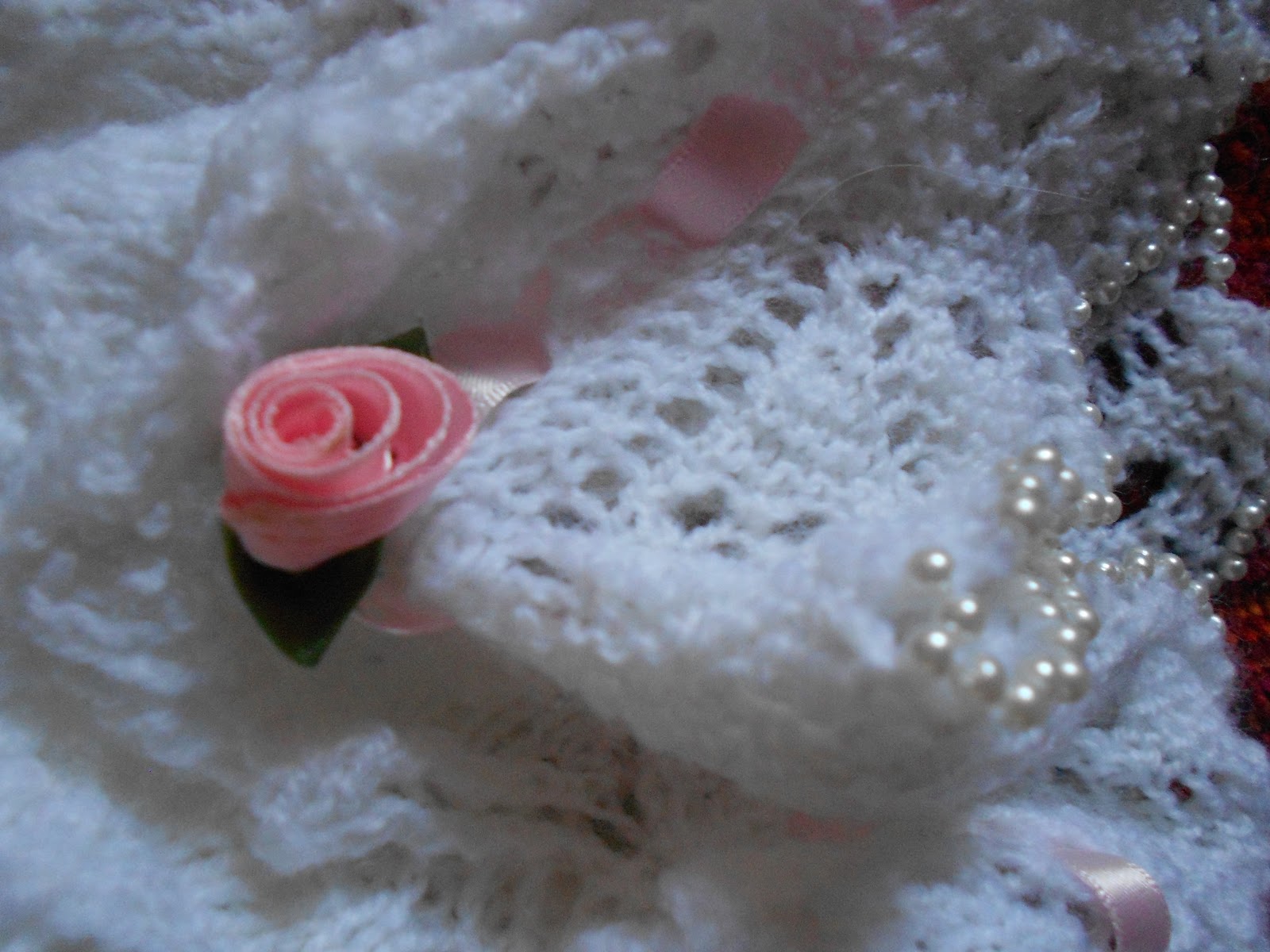
It is a white knitted dress.  The bodice is stocking stitch with pearls added, the skirt is a lace pattern.  The collar, cuffs and frill at the bottom of the skirt are knitted in a lace pattern with pearls all along the edges.  The bottom of the skirt is gathered with a fabric rosebud on each gather and there is pink ribbon threaded around the waist, neck and cuffs tied into a bow.

I hand-knitted this dress for the christening of my daughter twenty-two years ago, we lived in Yorkshire at the time.  It is knitted in 4 ply wool and the pearls are knitted in.  I originally knitted it as a traditional christening gown, but she was just a year old by the time of the christening, and walking, so I made the gathers in the skirt to shorten it and gathered in the waist so that if fitted her properly.  She wore a lace petticoat underneath which made it a little bit shorter as well.


My favourite part is the beads around the edge of the collar and the bottom, I can't actually remember how I did this, but I did thread all the beads on before knitting!


Even if I didn't know the history of this piece and had just come across it in a shop I think I would assume it was knitted with a lot of love for a special little girl.

I created a board of christening gown images on Pinterest

Project 3

COLOUR

STAGE 1 - INTRODUCTION AND PREPARATION
This was a very interesting exercise, although I did find it very difficult to achieve. I haven't painted a colour wheel for a very long time and found it quite hard to find the initial 3 primary colours to make a start. I started with the acrylic paints. I thought the colours achieved were fine but wasn't very keen on the quality and coverage, so decided to have another go with the block paints. These didn't give as good a colour change and the coverage was better but not great. I tried again with the inktense pencils and tried mixing the colours on the page, around the circle - which I think has given a very good effect and takes out the "stepped" look. I enjoyed the painting process though, but definitely need more practice.


Colour Wheel
This stage involved making a 12 colour circle using whatever medium was available. I tried it using acrylic paints, block paints and inktense pencils.


Primary Colours
RED . YELLOW . BLUE
Secondary Colours
ORANGE . GREEN . VIOLET
Tertiary Colours
RED/VIOLET . VIOLET/BLUE . BLUE/GREEN . GREEN/YELLOW . YELLOW/ORANGE . ORANGE/RED
Complementary Colours
RED-GREEN . BLUE-ORANGE . YELLOW-VIOLET

Tone and Saturation
I then tried mixing the complementary colours together .

I then tried adding black and white to different colours.

STAGE 2 - COLOUR PERCEPTION
Exercise 1
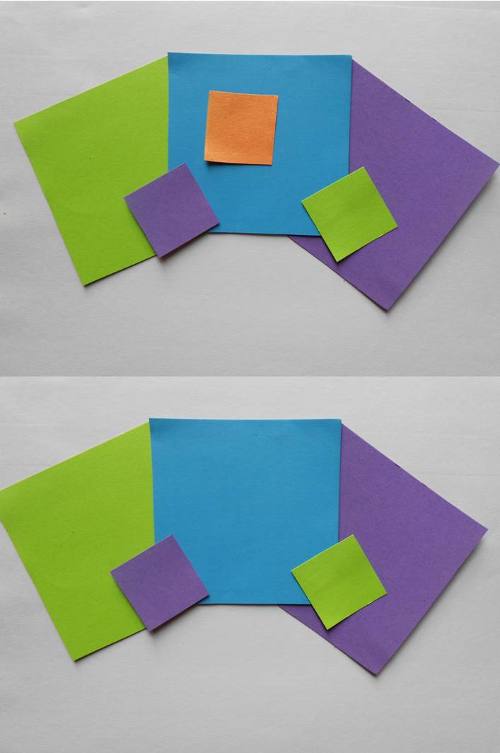
This exercise involved cutting out six large squares of different coloured paper and sticking them down on a sheet of paper.  On to the middle of each square I then glued down smaller squares, all the same colour but different from the larger squares. 


I have found this exercise very difficult.  It has been so difficult that it has brought my studies to a bit of a halt and I have spent a lot of time prevaricating rather than getting on with the exercise.

I had a look at other student's blog entries for this exercise but that didn't really help me at all - they all seemed to have just been able to get on with it.  So I have decided to just have a quiet sit down with the completed sheet and really just give myself time to study it.  So here goes .....

I chose purple, green, orange, blue, pink and yellow all with a red square in the middle. I then had to study these squares to see the effects on the red square of it being near to the other colours.

Still can't really see that much difference - even propped up. The red square disappears into the background on the pink square, looks larger on the blue and smaller on the orange squares and looks darker on the yellow. However, I don't know if this is what I am supposed to be seeing.

I tried the exercise again with green, pink, orange, turquoise, red and yellow large squares with a small blue square in the centre. Again, I found it really difficult to see anything - the small blue square looked darker on the turquoise and yellow and smaller on the green squares.

I then played around with different colour combinations.


From the above examples I prefer the 
one on the bottom right.


The above combination definitely looks better with the 
addition of the small orange square'


Exercise 2
This exercise involved nine coloured squares with a small grey square in the centre.  This was a more successful exercise as the grey centre did appear to change colour slightly depending on the colour of the large square.  The grey square took on a tinge of the complementary colour to the colour of the large square.

STAGE 3 - RECORDING COLOURS ACCURATELY
Exercise 1
I tried mixing different colours with watercolour and block paints. 


Tint
Any colour to which white has been added.
Shade
Any colour to which black has been added.
Tone
Any colour to which grey has been added.


The darker the colour being added - the less paint is needed.

Exercise 2
This exercise involved matching colours on a piece of brightly coloured fabric.  As you can see from the trial piece this was not as straight forward as it appeared.  I think I managed to mix the colours fairly well but the purple was the hardest to match.


Exercise 3
This was a similar exercise to the previous one, but this time with a printed image.  Again I think I have done a good job of matching the colours, except for the purple, which as the trial sample shows took quite a lot of trial and error.


Exercise 4
I used three pieces of fruit on a piece of blue paper to try and record colours of 3-D objects.  This was quite difficult and hard to see the actual colours.  I used the colours of the fruit with the blue to create the colour of the shadows.


STAGE 4 - COLOUR MOODS AND THEMES
Exercise 1
I found this exercise quite difficult.  I have made a lot of samples but didn't really think that they were successful.  These are the final eight I have chosen.

The first two on the top row are FRANTIC with the two underneath being CALM.  The next one is FIRE and the one underneath is FROST.  The next on on the top is HOT and the one below is COLD.


Exercise 2
I then chose six images and created colour bags/mood boards for each image.


STAGE 5 - COLOURED STITCHES
For this exercise I chose red and yellow thread on black linen.  I tried chain stitch, fly stitch, cross stitch, seed stitch, running stitch.


STAGE 6 - COMBINING TEXTURES AND COLOUR EFFECTS
Exercise 1
Using French knots for this exercise to give a pointillism effect, I used red and blue on a white background and tried mixing the threads in the needle.  I don't think this works with the darker colours.  It is quite a steep step when the blue is first added to the red, similar to the effect of adding too much black.


Exercise 2
The wider example is made by mixing the threads in the needle, through the three colours.  I used 6 strands of pink, then 4 pink/2 green, then 2 pink/4 green, then 6 green and the same through the green to blue.  In the narrower example I have mixed the amount of knots.

Mixing the threads has given a very gradual change in colour.

The next part of this exercise is choosing an image to work from.  I chose a photograph I had taken of barnacles, which I thought at the time would lend itself to french knots.  I tried two different sketches.  The first one I crumpled a brown envelope painted brown lines with paint on the edge of a ruler.  Then printed white with bubble wrap and built up the shapes with paint on a cotton bud.  For the second sketch I used shades of brown paint on brown paper and then sprinkled punched holes in various shades of cream and brown.


For my stitched sample I used a heavy weight piece of cotton.  I used fabric paint on the ruler to create the brown lines, and then printed white fabric paint on bubble wrap over the top.  I then used various shades of white, cream and grey thread for the french knots.  I am pleased with how this has turned out.


Sketchbook Work
In my sketchbook I looked at different colours and moods.  


I also listed words and ideas that accompanied each colour.  I made studies of different areas of the collage.


Review of Work
Were you able to mix and match colour accurately?
I think I did mix and match the colours accurately, except for the purple which was really difficult to get right.  I had expected this exercise to be really difficult but it wasn't as hard as I thought it was going to be.

Were you able to use colour expressively?
I found this exercise really difficult.  I made a lot of samples but wasn't really happy with them.  I think the samples I chose in the end expressed the emotions.  My favourites was the calm - achieved by using watercolour paint and sequin waste as a stencil.

Can you now see colour rather than accepting what you think you see?
Again I found this really difficult.  I had to look for a long time and found it hard to make a decision about what colour I was actually seeing.  I think the colours I chose for the fruit and paper were accurate though in the end.

Did you prefer working with water colours or gouache paints?  What was the difference?
I haven't got any gouache paint yet so don't know, I used to use gouache and did prefer it.  I like the way it can be used thick - like acrylic and also watered down as a watercolour.

How successful were the colour exercises in Stage 5?  How did they compare to the painting exercises?
I thought these exercises worked out well.  I used red and yellow on a black linen fabric.  In the wavy chain stitch the red looks brighter next to the yellow and darker when it is spaced further apart.  In the seed stitch sample the red stands out more in-between the yellow than the yellow in-between the red.  In the running stitch example again the red looks brighter where the rows are closer together.  On the seed stitch and detatched chain stitch both the yellow and red threads look different in each half.

Is there anything you would like to change or develop?
I would like to work more on producing moods with colour.  I found this exercise really difficult and I definitely need to work more on it.