STAGE 1 - REVIEW FABRIC COLLECTION
I selected a range of fabrics from my collection - cotton/linen/polyester/muslin/cotton jersey/calico/lining fabric/brocade. I experimented with various techniques and medium; ink through sequin waste, fabric paint on stamp, ink applied in swirls with paint brush, ink on damp fabric, over-stamped with fabric paint on a lid, folded fabric and ink, fabric crayon rubbing, ink on wet fabric, line design wallpaper used as a stamp.
STAGE 2 - SELECTING DESIGN IDEAS
I selected some of my experiments to take further onto fabric.
STAGE 3 - PRINTING AND PAINTING ON FABRIC
I used the eraser to print on the fabric with fabric paint, when it was dry I overprinted with the other side of the eraser that I had sliced a pattern into.
I made a Hexagon stamp and used it to print on top of bubble wrap printed fabric using fabric paint and onto a plain piece of cotton fabric
STAGE 4 - A LARGER SAMPLE
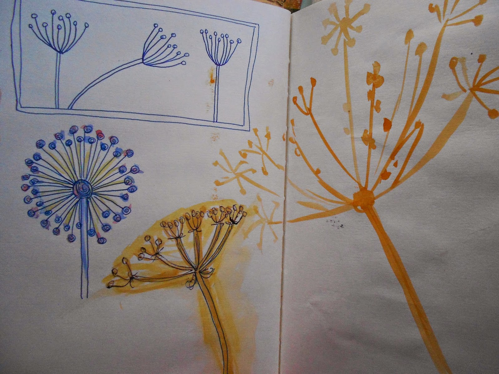
For my larger sample I decided to do a simple repeat pattern combining some of my favourite techniques from my experiments. I liked the calm example from Project 3: Stage 4 - Exercise 1 so I recreated this - making a shape by masking of a piece of sequin waste and using two colours of ink. I overprinted this with fabric paint on a piece of patterned wallpaper to create the lines. I then made a stencil of a simple seed head (from my sketchbook and mood board) and used fabric paint to stencil this over the top.
REVIEW OF PROJECT 5
Do you feel you made a good selection from your drawings to use as source material for your design ideas?
I found it quite difficult to select from my drawings, my style of drawing doesn't seem to lend itself to this kind of interpretation. I will either have to change my style or find a different way of translating what I have drawn. I think the images I chose to work from have worked well as design ideas.
Which interpretations worked best?
I think the block printing worked the best. This is the style I felt most comfortable with. The potato print was very successful, but the block doesn't last long. I like building up layers of different patterns.
Why?
I like working with stamps, but once I had managed to cut a stencil, this worked successfully as well.
Which fabric did you choose? What particular qualities appealed to you?
I chose fabrics that were smooth. I liked working with the linen most. It was lovely to handle and was smooth enough to work on. It has a nice weight and drape. I didn't like the polyester.
Is the scale of marks and shapes on your samples appropriate to the fabric?
I think the marks and shapes work well on the fabric. I think it has quite a retro feel.
Would any of your ideas work better on a different type of fabric, for example, sheer, textured, heavyweight?
I don't think the design would work on textured or sheer fabric.
Why?
I think it is quite a workmanlike design and needs a workmanlike fabric.
Do the marks and shapes seem well placed, too crowded or too far apart?
I like the spacing. I don't think they can be any closer together and if they were any further apart I think there would be too much blank space around each design.
Were you aware of the negative shapes that were formed in between the positive shapes?
I wasn't really aware of the negative shapes that were formed.
What elements are contrasting and what elements are harmonising in each sample?
The background shape is harmonising and the seed-head is then contrasting with it.
Is there a balance between the two that produces an interesting tension?
I think there is a balance and it does create an interesting piece.
How successful do you think your larger sample is?
I think it is a successful exercise. It isn't going to set the world on fire but as I haven't done anything like this before I think it is a very good start. I have enjoyed taking different ideas and putting them into one design, that I consider works well.
Do you like the design?
Yes I do like the design. I like the colours and the fabric. It is simple and effective.
Have you recreated or extended your ideas from the smaller samples so that there is a visible development between the two?
I think I have managed to develop this design from a series of different ideas.
Does your repeating image flow across the surface without obvious internal edges, or do the shapes and marks in your single unit sample relate well to the size and shape of the fabric?
The image certainly doesn't flow across the surface without edges but I think the shapes relate well to the size and shape of the fabric.
Do they make an interesting composition on this larger scale?
I think they do yes.


No comments:
Post a Comment