STAGE 1 - INTRODUCTION AND PREPARATION
This was a very interesting exercise, although I did find it very difficult to achieve. I haven't painted a colour wheel for a very long time and found it quite hard to find the initial 3 primary colours to make a start. I started with the acrylic paints. I thought the colours achieved were fine but wasn't very keen on the quality and coverage, so decided to have another go with the block paints. These didn't give as good a colour change and the coverage was better but not great. I tried again with the inktense pencils and tried mixing the colours on the page, around the circle - which I think has given a very good effect and takes out the "stepped" look. I enjoyed the painting process though, but definitely need more practice.
Colour Wheel
This stage involved making a 12 colour circle using whatever medium was available. I tried it using acrylic paints, block paints and inktense pencils.
Primary Colours
RED . YELLOW . BLUE
Secondary Colours
ORANGE . GREEN . VIOLET
Tertiary Colours
RED/VIOLET . VIOLET/BLUE . BLUE/GREEN . GREEN/YELLOW . YELLOW/ORANGE . ORANGE/RED
Complementary Colours
RED-GREEN . BLUE-ORANGE . YELLOW-VIOLET
Tone and Saturation
I then tried mixing the complementary colours together .
I then tried adding black and white to different colours.
STAGE 2 - COLOUR PERCEPTION
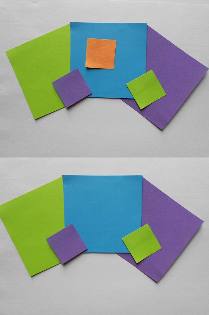
Exercise 1
This exercise involved cutting out six large squares of different coloured paper and sticking them down on a sheet of paper. On to the middle of each square I then glued down smaller squares, all the same colour but different from the larger squares.
I have found this exercise very difficult. It has been so difficult that it has brought my studies to a bit of a halt and I have spent a lot of time prevaricating rather than getting on with the exercise.
I had a look at other student's blog entries for this exercise but that didn't really help me at all - they all seemed to have just been able to get on with it. So I have decided to just have a quiet sit down with the completed sheet and really just give myself time to study it. So here goes .....
I chose purple, green, orange, blue, pink and yellow all with a red square in the middle. I then had to study these squares to see the effects on the red square of it being near to the other colours.
Still can't really see that much difference - even propped up. The red square disappears into the background on the pink square, looks larger on the blue and smaller on the orange squares and looks darker on the yellow. However, I don't know if this is what I am supposed to be seeing.
I tried the exercise again with green, pink, orange, turquoise, red and yellow large squares with a small blue square in the centre. Again, I found it really difficult to see anything - the small blue square looked darker on the turquoise and yellow and smaller on the green squares.
I then played around with different colour combinations.


Exercise 2
This exercise involved nine coloured squares with a small grey square in the centre. This was a more successful exercise as the grey centre did appear to change colour slightly depending on the colour of the large square. The grey square took on a tinge of the complementary colour to the colour of the large square.
STAGE 3 - RECORDING COLOURS ACCURATELY
Exercise 1
I tried mixing different colours with watercolour and block paints.

Exercise 2
This exercise involved matching colours on a piece of brightly coloured fabric. As you can see from the trial piece this was not as straight forward as it appeared. I think I managed to mix the colours fairly well but the purple was the hardest to match.

Exercise 3
This was a similar exercise to the previous one, but this time with a printed image. Again I think I have done a good job of matching the colours, except for the purple, which as the trial sample shows took quite a lot of trial and error.

Exercise 4
I used three pieces of fruit on a piece of blue paper to try and record colours of 3-D objects. This was quite difficult and hard to see the actual colours. I used the colours of the fruit with the blue to create the colour of the shadows.

I found this exercise quite difficult. I have made a lot of samples but didn't really think that they were successful. These are the final eight I have chosen.
The first two on the top row are FRANTIC with the two underneath being CALM. The next one is FIRE and the one underneath is FROST. The next on on the top is HOT and the one below is COLD.


STAGE 5 - COLOURED STITCHES
For this exercise I chose red and yellow thread on black linen. I tried chain stitch, fly stitch, cross stitch, seed stitch, running stitch.


The wider example is made by mixing the threads in the needle, through the three colours. I used 6 strands of pink, then 4 pink/2 green, then 2 pink/4 green, then 6 green and the same through the green to blue. In the narrower example I have mixed the amount of knots.
Mixing the threads has given a very gradual change in colour.
The next part of this exercise is choosing an image to work from. I chose a photograph I had taken of barnacles, which I thought at the time would lend itself to french knots. I tried two different sketches. The first one I crumpled a brown envelope painted brown lines with paint on the edge of a ruler. Then printed white with bubble wrap and built up the shapes with paint on a cotton bud. For the second sketch I used shades of brown paint on brown paper and then sprinkled punched holes in various shades of cream and brown.

For my stitched sample I used a heavy weight piece of cotton. I used fabric paint on the ruler to create the brown lines, and then printed white fabric paint on bubble wrap over the top. I then used various shades of white, cream and grey thread for the french knots. I am pleased with how this has turned out.


I also listed words and ideas that accompanied each colour. I made studies of different areas of the collage.

I then tried adding black and white to different colours.
STAGE 2 - COLOUR PERCEPTION
Exercise 1
This exercise involved cutting out six large squares of different coloured paper and sticking them down on a sheet of paper. On to the middle of each square I then glued down smaller squares, all the same colour but different from the larger squares.
I had a look at other student's blog entries for this exercise but that didn't really help me at all - they all seemed to have just been able to get on with it. So I have decided to just have a quiet sit down with the completed sheet and really just give myself time to study it. So here goes .....
I chose purple, green, orange, blue, pink and yellow all with a red square in the middle. I then had to study these squares to see the effects on the red square of it being near to the other colours.
Still can't really see that much difference - even propped up. The red square disappears into the background on the pink square, looks larger on the blue and smaller on the orange squares and looks darker on the yellow. However, I don't know if this is what I am supposed to be seeing.
I tried the exercise again with green, pink, orange, turquoise, red and yellow large squares with a small blue square in the centre. Again, I found it really difficult to see anything - the small blue square looked darker on the turquoise and yellow and smaller on the green squares.
I then played around with different colour combinations.

From the above examples I prefer the
one on the bottom right.
The above combination definitely looks better with the
addition of the small orange square'

STAGE 3 - RECORDING COLOURS ACCURATELY
Exercise 1
I tried mixing different colours with watercolour and block paints.
Tint
Any colour to which white has been added.
Shade
Any colour to which black has been added.
Tone
Any colour to which grey has been added.

The darker the colour being added - the less paint is needed.
Exercise 2
This exercise involved matching colours on a piece of brightly coloured fabric. As you can see from the trial piece this was not as straight forward as it appeared. I think I managed to mix the colours fairly well but the purple was the hardest to match.

This was a similar exercise to the previous one, but this time with a printed image. Again I think I have done a good job of matching the colours, except for the purple, which as the trial sample shows took quite a lot of trial and error.

I used three pieces of fruit on a piece of blue paper to try and record colours of 3-D objects. This was quite difficult and hard to see the actual colours. I used the colours of the fruit with the blue to create the colour of the shadows.

STAGE 4 - COLOUR MOODS AND THEMES
Exercise 1I found this exercise quite difficult. I have made a lot of samples but didn't really think that they were successful. These are the final eight I have chosen.
The first two on the top row are FRANTIC with the two underneath being CALM. The next one is FIRE and the one underneath is FROST. The next on on the top is HOT and the one below is COLD.

Exercise 2
I then chose six images and created colour bags/mood boards for each image.


For this exercise I chose red and yellow thread on black linen. I tried chain stitch, fly stitch, cross stitch, seed stitch, running stitch.

STAGE 6 - COMBINING TEXTURES AND COLOUR EFFECTS
Exercise 1
Using French knots for this exercise to give a pointillism effect, I used red and blue on a white background and tried mixing the threads in the needle. I don't think this works with the darker colours. It is quite a steep step when the blue is first added to the red, similar to the effect of adding too much black.

Exercise 2
Mixing the threads has given a very gradual change in colour.
The next part of this exercise is choosing an image to work from. I chose a photograph I had taken of barnacles, which I thought at the time would lend itself to french knots. I tried two different sketches. The first one I crumpled a brown envelope painted brown lines with paint on the edge of a ruler. Then printed white with bubble wrap and built up the shapes with paint on a cotton bud. For the second sketch I used shades of brown paint on brown paper and then sprinkled punched holes in various shades of cream and brown.

For my stitched sample I used a heavy weight piece of cotton. I used fabric paint on the ruler to create the brown lines, and then printed white fabric paint on bubble wrap over the top. I then used various shades of white, cream and grey thread for the french knots. I am pleased with how this has turned out.
Sketchbook Work
In my sketchbook I looked at different colours and moods.


Review of Work
Were you able to mix and match colour accurately?
I think I did mix and match the colours accurately, except for the purple which was really difficult to get right. I had expected this exercise to be really difficult but it wasn't as hard as I thought it was going to be.
Were you able to use colour expressively?
I found this exercise really difficult. I made a lot of samples but wasn't really happy with them. I think the samples I chose in the end expressed the emotions. My favourites was the calm - achieved by using watercolour paint and sequin waste as a stencil.
Can you now see colour rather than accepting what you think you see?
Again I found this really difficult. I had to look for a long time and found it hard to make a decision about what colour I was actually seeing. I think the colours I chose for the fruit and paper were accurate though in the end.
Did you prefer working with water colours or gouache paints? What was the difference?
I haven't got any gouache paint yet so don't know, I used to use gouache and did prefer it. I like the way it can be used thick - like acrylic and also watered down as a watercolour.
How successful were the colour exercises in Stage 5? How did they compare to the painting exercises?
I thought these exercises worked out well. I used red and yellow on a black linen fabric. In the wavy chain stitch the red looks brighter next to the yellow and darker when it is spaced further apart. In the seed stitch sample the red stands out more in-between the yellow than the yellow in-between the red. In the running stitch example again the red looks brighter where the rows are closer together. On the seed stitch and detatched chain stitch both the yellow and red threads look different in each half.
Is there anything you would like to change or develop?
I would like to work more on producing moods with colour. I found this exercise really difficult and I definitely need to work more on it.
No comments:
Post a Comment