Pages

Tuesday 29 May 2012

Assignment 1 - Reflective Commentary

Having completed Assignment 1 it is now time to reflect on my experience with OCA so far.  

I have really enjoyed starting this degree - it feels like a very positive move - but I didn't expect to feel so isolated.  Having just completed two years doing ‘A’ Level Textiles at night-school - and although I wasn't working directly with other students, I was able to discuss my progress and ideas face-to-face with my tutor and took my exam at school with everyone else.  However, as the course progresses I hope to link up with other students and also attend some research visits and workshops.


The 
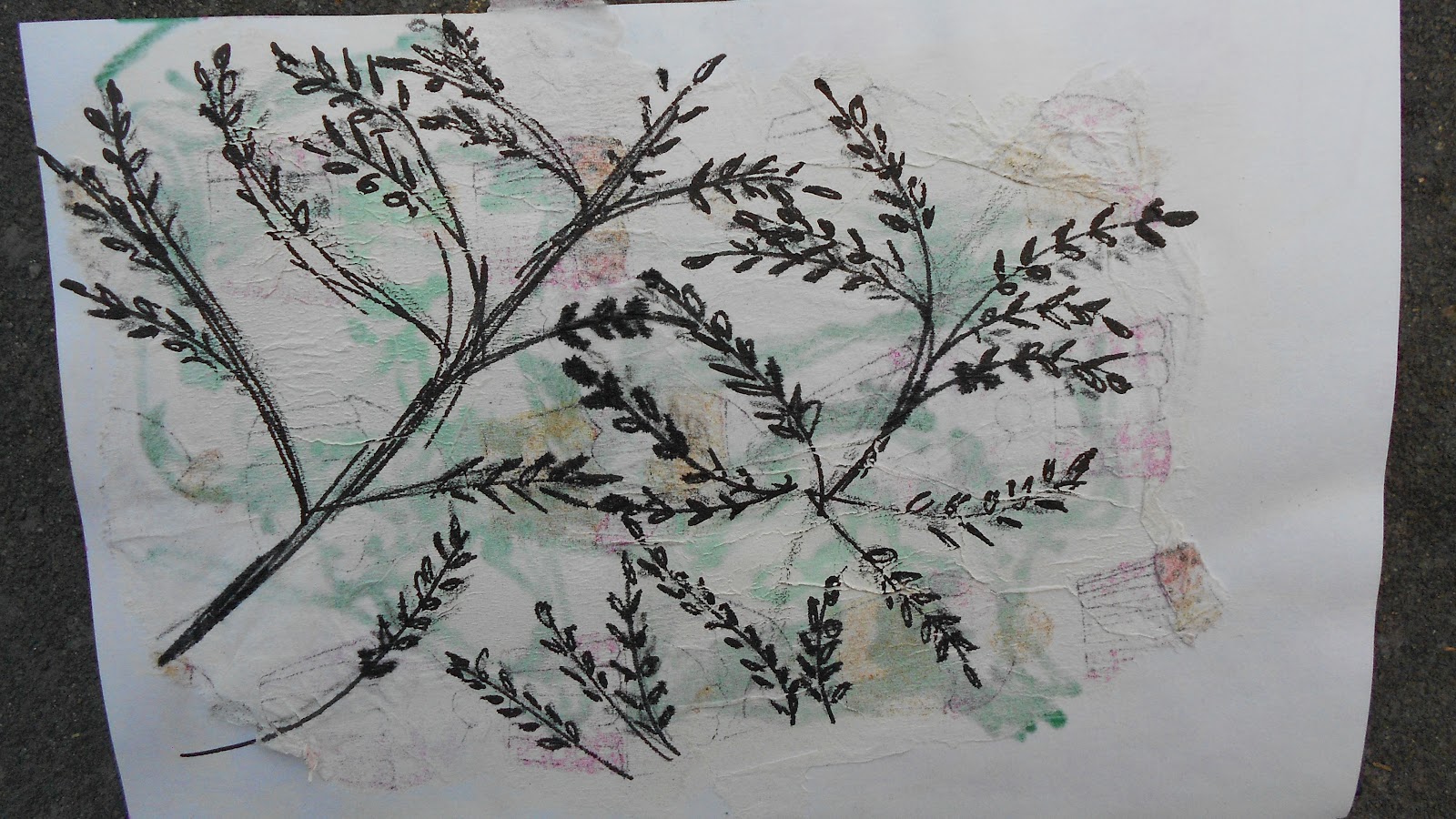
mark making exercises helped me to take my drawing further - my friend said to me "if you can make all these marks - you can use them in your drawings" which seemed to make a lot of sense and helped to make the connection between the mark making and the drawing.  I have found that being pushed to use a sketchbook certainly improved my drawing ability, so I am definitely hoping that this will continue to improve, but I am pleased with my progress so far, I even attempted drawing a person - the first time ever!
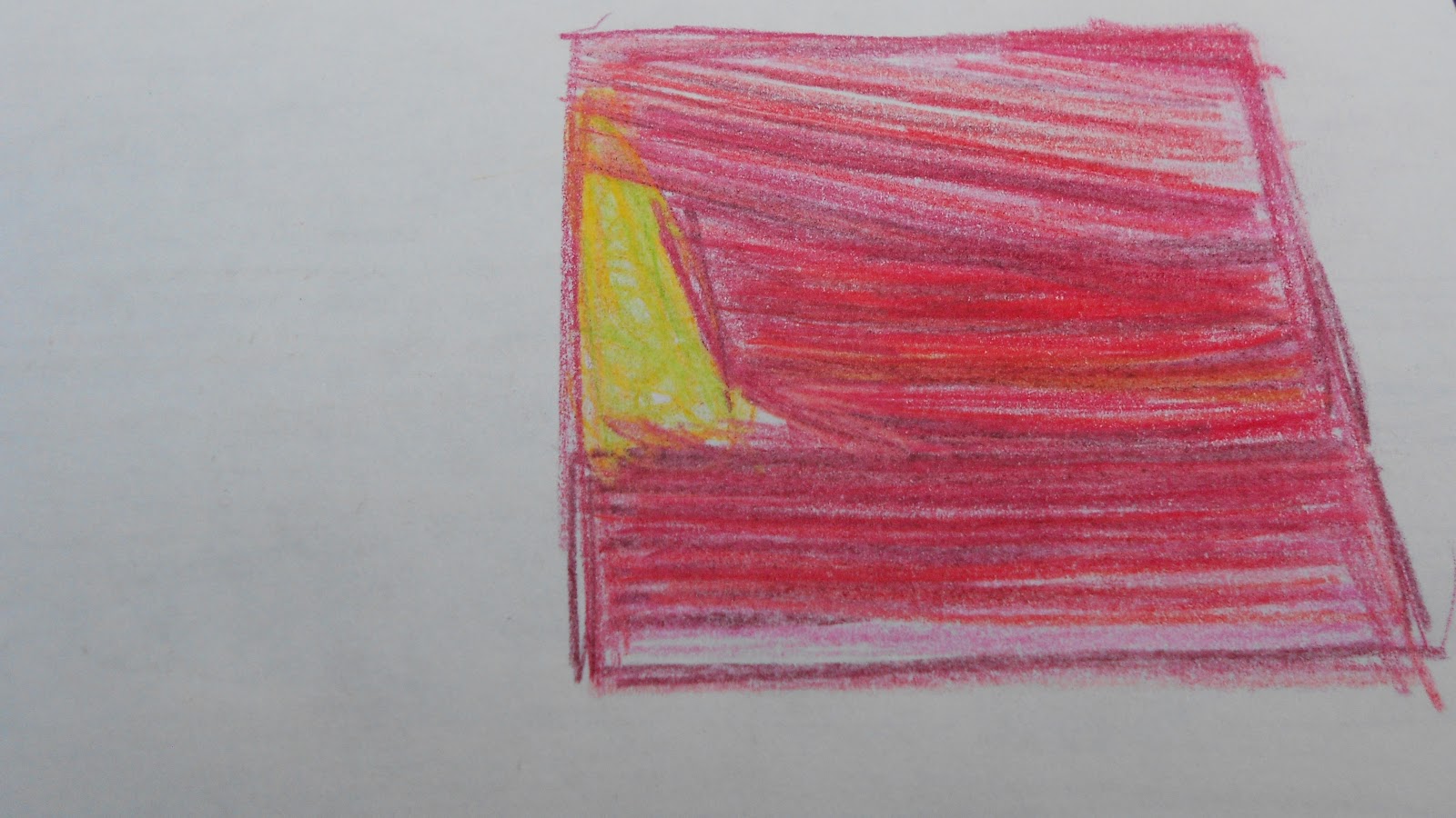
For drawing I find I enjoyed working in Biro or gel pen the most.  Although I did like the graphite and charcoal sticks, both are messy afterwards and need fixative, which is not always to hand - a Biro is always available, clean and any mistakes just have to be worked with or around and there is less time to be indecisive, you just have to get on with it.

The exercises I enjoyed the most was Project 2; Exercise 4 - Preparing to create texture.  I loved looking through all my fabrics and papers and selecting appropriate colours/textures/threads/etc.  I do like to make the yarn wraps as well - I find even if I don't use those particular threads, it does concentrate my mind on the colours I will need.


One area I would like to develop is printing.  I love printing - the unexpected outcome is always exciting.  Recently at night-school  we had a go at mono-printing which I thoroughly enjoyed, I would like to try this technique on fabric next.

I think I still need to let go more.  I feel my work is still very safe.  I need to experiment more and not be afraid to make mistakes.  My drawings also need to be more experimental.  Some of the embroidery stitches I had not done before (Cretan stitch) and some I had used and had never been happy with (stem stitch), so I definitely need to keep an open mind about what stitches to use. 

Sunday 27 May 2012

Research Point - Oriel Davies, Newtown

I live in quite a rural part of mid-Wales so there are not many galleries that are just local but as I was in Newtown I decided to visit Oriel Davis - a contemporary art gallery.  The current exhibition is by Pia Borg - she was the winner of the RE:animate Oriel Davies Open in 2010 and this solo exhibition was part of the prize.  I wouldn't have chosen this exhibition but as there is not a lot of choice locally I thought I would go and have a look.  I was a bit non-plussed at first but decided to sit on the benches provided and watch the films and I was surprised to find that I actually enjoyed the experience.


The Crystal World was projected onto a large wall and the soundtrack filled the gallery.  It was a black and white film and showed an old car at the bottom of a lake, half hidden by the plant life.  There was also a woman, drowned, in the water.  Crystals were forming over all the surfaces.  The soundtrack was just old fashioned type music.  I sat on the bench and decided to not try and "get it" and just enjoy the experience.  The film had a very serene feel to it, especially with the music playing - even though the image of the drowned woman was a bit disturbing.  The formation of the crystals was beautiful - the angles and shapes and subtle light changes.

Another film was shown in a separate little room, again with a bench and headphones provided.  I found the headphones drew me into the film more, as it cut out any distractions.  This was an film about a piano player and a woman upstairs listening to his music and dancing.  The characters were all animated puppets.

Also being exhibited at the same time was Lament by Sean Vicary, who is an artist and filmmaker based in Wales.  This film showed the local landscape, which is stunning anyway, the soundtrack was traditional music and a welsh accented woman reciting bi-lingual poetry.  I found the film very soothing, I liked the poetry and enjoyed it in Welsh - even though I don't speak Welsh - but the lilt and rhythm of the language suited the images of the local landscape.  I found the animations amusing.  Vicary uses found objects and animates them within the landscape - found bones were animated into a small dragon like creature with a beating heart (that was a decayed conker).

The exhibition was well displayed, the gallery space was created so that it was enclosed and dark.  The artist details were projected onto a wall, which I liked as it was a film and animation exhibition.  The benches to sit on were comfortable but contemporary looking.  There is a separate section, for students, to sit in and use the reference material.


Sketchbook #3

These are two quick sketches I did in my lunch break.  The first one is yoghurt pots, drawn with a biro on an old envelope.  It looked a bit weak so I went over it with oil pastels.

This is another biro drawing from a photograph of a marionette that I took whilst I was in Prague.  I like how this has turned out and especially the shading around the edge of the face.

Playing with machine stitching.  I used a very heavy fabric so that I didn't need a hoop.  Just tried to draw a kettle, then added some ink colouring.


Black pen and watered down block paint wash.  These were copied from some drawings, but I can't remember who they were by originally.


I had drawn some feathers with Indian ink, but I had used both sides of the paper.  These little snippets were what was left after I had cut out the better feather drawings.  I decided to stick them down in a collage, and added some colour with washable felt tip pens, which I then went over with water on a flat brush.  I like how these have turned out and am going to try the washable felt pens and water again.


Two more quick lunch break sketches inspired by the Astronomical Clock in Prague.  The first one is biro on an old envelope, the second one I tried sticking down different papers before I did the biro sketch.  I don't think either of these is very good, but will be trying the different papers idea again.


More playing around with the machine just to see what different ideas looked like.  Thick base fabric so that no hoop was needed.


Project 2 - Stage 6

Using Thread And Yarns To Create Texture
I chose this picture because I love this colour combination.  The beautiful green grass, then the yellow going into the purple.  I made a quick sketch using coloured pencils to see what kind of stitches might work.  I then chose a range of fabrics, papers and threads in the colours of the picture.


I tried a small sample using the three colours and some simple stitches.  Fly stitch for the grass, random cross stitch for the yellow, and seed stitch over pieces of different fabrics for the purple sky. 


I made a yarn wrap with different types of yarn.  I find this a very useful exercise, even if I don't end up using these particular yarns, it does make it easier to identify the colours I need.


For the final sample I used a piece of heavyweight polycotton for the background.  I then chopped up small pieces of the different fabrics in the three colours and used pieces of net over the top to keep them secure.  I then burnt into the layers with a soldering iron, which melted them together.  I then used a random fly stitch over the entire piece to hold all the pieces together.  Over the top of all of these layers, I added beads, and sequins and additional stitching.

On the right of the page is a paper collage, which I thought looked good, but having seen it in the photograph it needs less green and more purple.

I have really enjoyed working on this piece.  I love the colours and the proportions of the original picture.  I think the final piece is alright - not quite what I had in mind when I started, I think the smaller trial sample is more like the picture.


Do you feel happy with your work?
I feel happy with the work I have created so far, although some of it hasn't worked out as I had expected and would need further experiments to get the effect I thought I would get.
Do you prefer working with stitch to drawing?  Can you begin to see the relationship between the two?I think I prefer working with stitch than drawing, my drawing experience in the past has not been very successful - but I have been happier with my drawing progress on this course - so this may change.  I have recently read the book Drawn to Stitch by Gwen Hedley and found a lot of her drawing ideas really exciting and I am going to try some of these and see what this produces. I can definitely see the relationship now between drawing and stitch.

Having worked through Stage 2, were you able to choose stitches which expressed the marks and lines of your drawing?I like the small sample that I produced initially and I think the stitches used were a good choice, I am not as happy with the finished sample and feel the stitch choice could have been different and more experimental.  I could have tried one of the messier stitches on the sky area, and a straight stitch shading for the green and yellow area.

Do you feel that you chose the right source materials to work from?
I am happy with the source material, I like the layers and colours created by the many pieces of different fabrics under the net.
Do you think your sample works well irrespective of the drawing?  Or do you think the sample is just a good interpretation of your drawing and nothing more?
I think the final sample works well irrespective of the drawing.

Which of the activities did you prefer - working with stitch to create textures or working with yarns to make textures?  Which worked best for you and why?
I like all the ways of creating texture, I especially like to use fabric folds and gathers to create the texture and add to this surface with stitch.  I think this builds up a richer surface and creates hidden areas, so that the whole piece isn't revealed at once.

Make some comments on individual techniques and sample pieces.  Did you experiment enough?  Did you feel inhibited in any way?
I think I did experiment enough and I didn't feel inhibited in any way.  Having not worked in this way before, I think I have made a good start on different techniques.  I have experimented with a lot of different ideas, many of which I intend to develop further.  I like the fabric folding and gathering and the messy stitch samples.  I also like using the ribbon yarn laid flat on the fabric and couched into place.
How do you prefer to work?  From drawing or by playing with materials and yarns to create effects?  Which method produced the most interesting work?
I prefer to play around with fabric, yarns and thread, which I think have created the most interesting samples, but I intend to try out some of the ideas from Drawn to Stitch, so this may change in the future.
Are there other techniques you would like to try?  Are there any samples you would like to do in a different way?
I intend to do more machine stitching.  This will involve finding an area where my sewing machine can stay out permanently.  The sample for Project 2 - Stage 4 - from a piece of bark I had photographed - I would do differently - build up more coloured layers of fabric to start with and then build up more layers of the ribbon yarn to give a better depth.
Is there anything you would like to change in your work?  If so, try to think out why and make notes for further reference.
For Project 2 - Stage 3 - A Sample - I think I should have chosen softer, more washed out colours; greys or browns.  I chose blacks because of the sketch I had done with a black gel pen, but after looking at the actual leaf I realised it wasn't black at all.  I think that the use of soluble fabric would have created some good effects as well.  I also need to be careful when burning the fabric, not to burn the background material!

Wednesday 23 May 2012

Research Point - National Slate Museum


I must admit I wasn't particularly looking forward to this visit, but it turned out to be a great day!


We wandered around for the best part of 3 hours, it was a fascinating place.

The colours of the slate were amazing.


There were inspiring images everywhere.


Industrial Inspirations  - there was an exhibition in one of the buildings. Students from the local Coleg Menai had worked with 5 local artists and taken inspiration from this museum and another one at Blaneau Ffestiniog. 


This was my favourite piece.  A portrait of a miner using lots of pieces of fabric and old knitwear, with a lot of machine embroidery over the top.  It was slightly padded.  I thought it captured the colours and feelings of the place really well.  It was approximately 35 x 50 cm.  It is a twist on the use of old clothing to make patchwork blankets.


This piece by Lydia London I also really liked.  These were only small, about 20cm, painted onto cardboard, but the colours and feelings evoked by them really summed up the whole place.


Here again, I thought that the colours and the atmosphere of the whole place had been beautifully captured.  This is by Elin Meredydd.


A beautiful felted piece by Mirain Grifiths.


I thought all of the work was of a very high standard, well thought out and produced and all the pieces had captured the essence of the slate industry really well.

Photographs of this exhibition can be seen on their Facebook page 

Sketchbook #2

A few more pages from my sketchbook.


Quick sketch to see what different stitches could be used to re-create this gerbera.


Based on grasses growing  near the barn.


Close-up detail of the rhubarb drawing, I love these colours.


Little sketches using Inktense pencils based on one of my photographs.  I had chosen the plants initially because of the coral flowers against the green leaves and the dark leaves with the light coloured veins against the beautiful red and green leaves.


Pencil drawing of a tennis ball and golf ball.


On the left is a biro drawing I did in my lunch break, I then recreated it with gel pen and a pale wash.


This is my first ever attempt at drawing someone.  My son was sat on the sofa so I just used an advert that had fallen out of a magazine and a biro that was on the coffee table.  I was sorry afterwards that I hadn't found a blank sheet of paper, but I was only looking at his hood to start with, then just kept doing a bit more and a bit more .... until dinner was ready!

Art Class Wednesdays #1

I go to evening classes, every Wednesday at the local high school.  These are very informal classes, just a group of friends getting together to enjoy cake and cuppa really.  However, it does give us the chance to try out different techniques and to use equipment that we don't have at home.

These are some of drawings I have done whilst at these classes.

Pointillism - using the block paints quite watery, I had a go at drawing a dead leaf using the pointillist technique.  I wasn't looking forward to doing this at all, I have only every tried pointillism with a pen and find it very labourious, but using paint and a brush was much more successful and I like the idea of making a palette of colours, as I go along, as they are used.  I think this would be very useful for matching fabric and threads to develop the work into a textile piece.


Ink and Dip Pen - this is always a favourite medium to work in.  I used the ink and a scratchy dip pen to draw the poppy and shell shape, then used watery ink to add the washes.  I like how the shell and the large poppy head have turned out.


Indian Ink and Dip Pen - this time we tried Indian ink and a dip pen, which is quite nice to draw with, I like it when it blobs and the finish is quite shiny.


Mono-prints- great class today - working on mono-prints.  

I put purple printing ink onto a glass sheet and rolled it until I had a evenly covered square of ink.  I then blotted this lightly with a sheet of sugar paper.  

With a sheet of cartridge paper over the ink I drew shell shapes - firstly with a blue softish pencil, which was quite difficult to work with and I had to press on the paper really hard, then with a red Biro - which created a better print and was a lot easier to work with.


I liked the way the prints turned out, lots of inspirational images to work with.  I liked the drawings as well, so I photocopied these so that I could use these to work from as well.  The next image are my favourites that I think have worked well as drawings and prints.